Though many forms of literature display information in the same style throughout each page (e.g., fiction novels, medical forms, and philosophy textbooks), web content is engaging when the style varies within a consistent set of conventions. After all, the primary goal of a website is to help visitors find what they are looking for quickly, and an intentional use of styles can enhance this effort.
The application of styles in web content is both a practice of art and a study of science. Though it can take a refined eye to find the ideal balance between these two worlds, the Modern Campus CMS editor gives you a palette of options to choose from as you stylize your text, images, and hyperlinks.
|
How to Apply a Style
While you are Editing a Page, you have the ability to stylize content through several pre-defined options in the ![]() menu, in addition to various Headings. Some of these styles are used for plain text, while others are used for images or hyperlinks. For guidelines about each style, see the descriptions below.
menu, in addition to various Headings. Some of these styles are used for plain text, while others are used for images or hyperlinks. For guidelines about each style, see the descriptions below.

This style is the default format for the first section of text on Interior Pages.

This style is the default format for the first section of text on Landing Pages.

This style is small and pairs well with the  style.

This style is used sparingly to call attention to important or "alert" information.

This style aligns an image to the left when it is added to the same paragraph as the text.*

This style aligns an image to the right when it is added to the same paragraph as the text.*

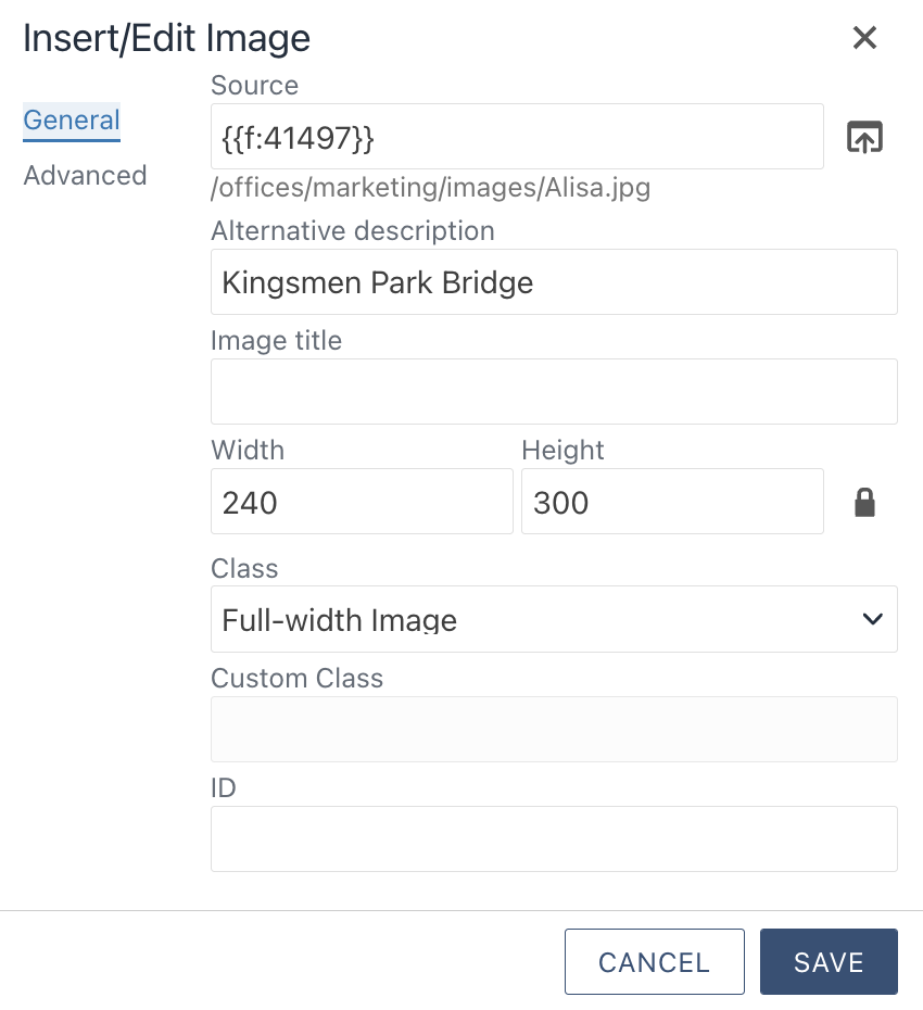
This style displays an image across the full width of the page, with no text adjacent to it.*

This style is a good choice for a hyperlinked call-to-action with text that is too long for a button (5+ words).

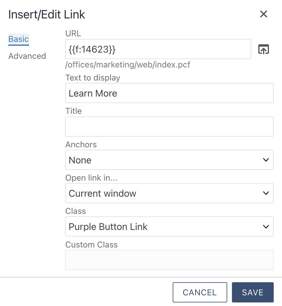
This style is a good choice for a hyperlinked call-to-action in a prominent format with short text (1-4 words).**

This style is a good choice for a hyperlinked call-to-action in a prominent format with short text (1-4 words).**

This style is a good choice for a hyperlinked call-to-action in a prominent format with short text (1-4 words).**
PRO TIP: A few notes to enhance your sense of style...
- When it comes to style, less is more. Only use bold font in small doses and stick with the color codes from the university's Brand Identity. In all situations, use the above styles and Headings.
- With multiple buttons on a page, the color of buttons can indicate their similarities or differences. Consider stylizing buttons of similar content with the same color, while stylizing buttons of a different type of content with a different color. When in doubt, be conservative in your use of color.
- If you want to make a button larger in size and you have access to edit the Source Code in Modern Campus CMS, enter btn-large in the class attribute (e.g., class="btn btn-arrow-right btn-large green").
* To avoid technical difficulties with image options in the ![]() menu, use the following workflow:
menu, use the following workflow:
- Insert an image with the Insert/Edit Image
 tool.
tool. - Complete the fields within the Insert/Edit Image window to enter the Source, Alternative description, Width, Height, and Class (choose Left-aligned image, Right-aligned image, or Full-width image).
- For further details, see the Images article or the example below.

** To update all settings for hyperlink options in the ![]() menu, use the following workflow:
menu, use the following workflow:
- Insert a hyperlink with the Insert/Edit Link
 tool.
tool. - Complete the fields within the Insert/Edit Link window to enter the URL, Text to display, Open link in, and Class (choose Link with Arrow, Purple Button Link, Gold Button Link, or Green Button Link).
- For further details, see the Hyperlinks article or the example below.

| < Previous Article |
 Instructional Video
 icon for best view.
